
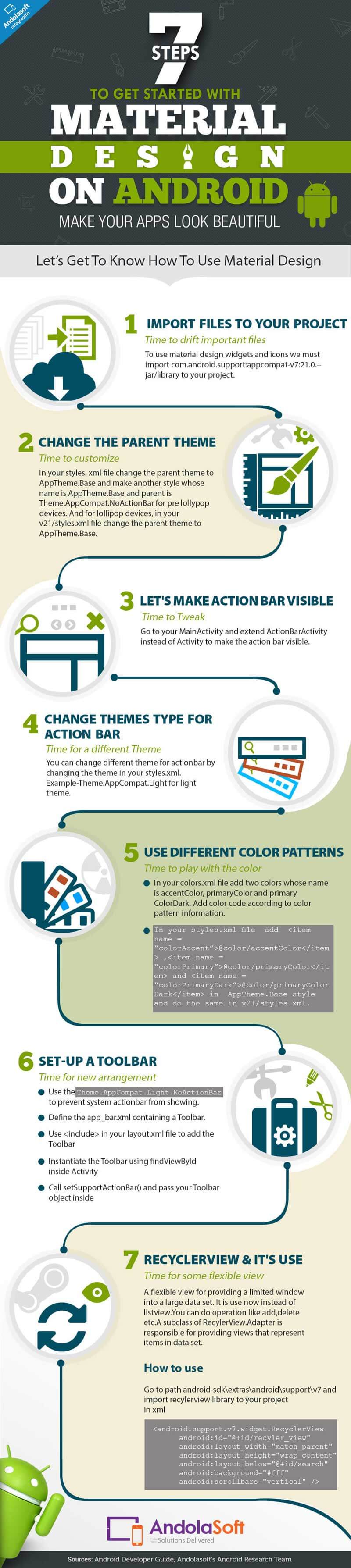
What is Material Design!
Material design introduced in Android Lollipop. A lot of new things are added in material designs such as new widgets, custom shadows, custom animations and more. However, there are certain principles and guidelines for every design implementation.
 New widgets and components in Material Design
Toolbar and Statusbar:
Now, instead of actionbar we are using toolbar because actionbar is deprecated. Statusbar is above toolbar where you see notification icons. It’s more flexible and you can use different color patterns.
Color pattern for toolbar and statusbar:
Toolbars and larger color blocks should use the primary 500 color, which should be the primary color of your Android app. The statusbar color on the other hand should be darker than primary color, i.e. somewhere around 700 tint of your primary color. For color references, check – Google ‘Material Design Color Page’.
Accent color – It is generally used for your primary action button or floating action button and components like switches.
Just try it yourself
With all the steps mentioned above, you will be able integrate material design in your Android App. If you feel this article is helpful and interesting, please spread a word about it to your friends & teammates by sharing this article on Facebook, LinkedIn or Twitter.
We will be glad to receive any comments or view. For any further assistance our Android experts will be happy to help. Please Visit Andolasoft’s Android Service for more information and details. You can also write to us at [email protected]


